Welcome!
Logoskool is an educational initiative based on the appreciation and criticism of logo design.
We invite all logo lovers out there—amateurs, professionals, and anyone else who can’t stand the littering of our nation’s eyeways.
Join us for a fun, eye-opening romp through the wonky wonderland of logos, in our relentless pursuit of graphic excellence.
What’s Up
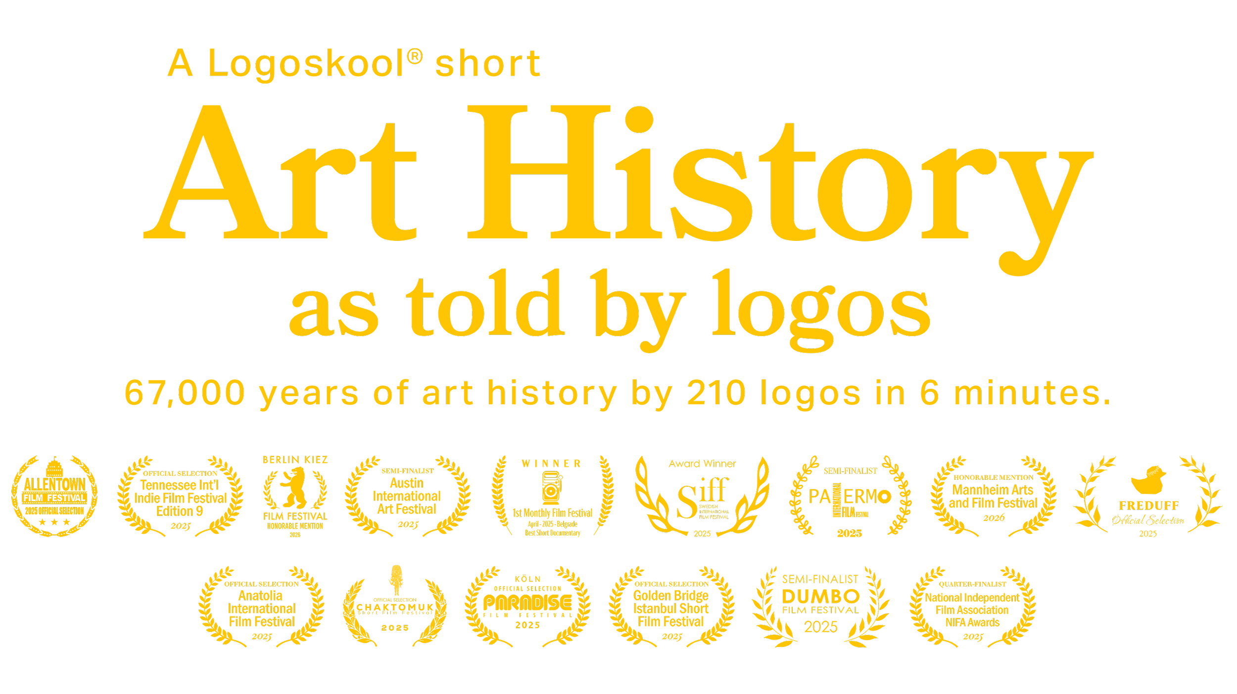
We’re excited to announce that our inaugural film Art History as told by logos has already been selected in 23 film festivals, with screenings in ten countries, and has earned two European category-awards (as of November 9, 2025).
Film Poster
Director’s Statement
“The film simulates a chronological tour through an encyclopedic museum, where 210 logos of varying quality reflect their art historical sources by year, from paleolithic to contemporary. It’s a rich mix of cultures and concepts along a fast-paced timeline ending in 1994. My hope is that the film ignites a spirited discussion of what goes into good logo design.”
—Greg Gersch
Coming Soon
The film is not publicly available until after the film festival cycle ends. However, a confidential private link may be sent to certain qualified reviewers.
Please inquire using the form below.
Sign up
...for upcoming notifications, events, publications, podcasts and educational materials. The Key to Art History as told by logos, a handy decoder that reveals all the logos and their respective art historical sources will be made available after the film festival cycle ends.
Your data will be kept strictly confidential.
FAQs about Logoskool
Why the offbeat name?
The alternative spelling references “Playskool,” a 1928 American brand of wooden blocks and toys used as teaching aids in the classroom and to foster creative expression in children.
Logoskool is all about learning, unlearning and relearning the fundamentals of logo design. And making it fun.
Is that mark a pine cone?
Yes—obviously stylized. The pine cone is a classic symbol in ancient mythologies denoting fertility, immortality, higher conciousness, enlightenment, “the third eye.”
As a natural object, it evokes positive sensory/emotional associations: fragrant, woodsy, seasonal, warm, protective; seed, growth, potential, evergreen, tree, life, knowledge, wisdom.
Are the colors significant?
The yellow/black pairing is one of nature’s most attention-grabbing color combos: associated with industriousness, working in harmony, sweetness—and a little sting.
FAQs about the film
Was your selection of 210
logos affected by personal bias?
It’s hard to avoid. The “mere exposure effect”—the psychological phenomenon that repeated exposure to a stimulus, even subliminally, leads to a preference for that stimulus—is unavoidable. But we did our best to be as inclusive and non-Western-centric as possible.
Isn’t “logos of varying quality”
a subjective call?
Yes and no. You can’t criticize someone’s initial gut reaction. There will always be first impressions; however, real understanding and appreciation of a logo requires in-depth analysis after repeated viewings over time. Logoskool provides all the necessary analytical tools.
Why does the timeline
stop at 1994?
The 1990s may well be referred to as the “LCD Era” (Lowest Common Denominator). While a handful of brilliant American logo designers emerged in that decade, they were few and far between. Some critics say this decline was also reflected in the international art market. Conclusion: the 1990s ushered in a dark time for logos. But we’ll save that discussion for a future class.
It’s a bit fast-paced.
How can you take in
all the levels at once?
Granted, it’s impossible to absorb everything in one sitting, so we recommend three viewings:
1. Meditate: Just sit back and enjoy each logo as it appears. Don’t try to absorb anything else.
2. Connect: Rest awhile. Allow yourself to process all the visual input, ideally overnight. Then watch it again, this time focusing on the year under each logo, guessing what the art historical reference might be.
3. Study: When The Key is available (after the run of film festivals), download it and watch the film again, at 0.5x playback speed, with the audio off. Use The Key to identify the brand and its source, stopping as needed along the way.
What should you keep in mind
while judging the logos?
Here are some points to ponder:
Art history is a rich source of inspiration.
Not all the logos are well designed.
Drawing inspiration is just the first step.
Drawing ability is the challenge—critical for exploring a wide range of possibilities, and for proper execution.
These logos are stripped of color and context, to be judged strictly on their form.
Ask yourself: What’s working? What’s not working? What can be improved?
A lot of hard work and research went into the film, but there’s always room for improvement. We welcome your feedback—questions, comments, criticisms, suggestions. Thank you!
The Mission
Teaching you how to cultivate and maintain a discerning eye, so you can know what “good” looks and feels like. Logoskool is an “expression of care” (Fred Rogers), in a time when our landscape, roadways, urban centers—and logos—are becoming increasingly crass and soulless.
Logoskool is:
A refresher course in logo fundamentals: strategy, naming, typography, form, color.
A treasure chest of new analytical tools and freeform exercises to test, expand and embed your new learning.
Filled with back stories, personal experiences and hands-on/eyes-on labs.
Committed to relentless striving for visual accuracy, brutal honesty and professional integrity.
The Promise
Logoskool is as good as a liberal arts education—at a fraction of the cost. You’ll never see the world the same way again. Guaranteed!
Write us


